 Angry Birds is a media franchise aimed at young children. Originating from the Angry Birds game, the brand now has a variety of media for their audience to indulge in. The website helps to make these all accessible and easy to find by having them part of the same website.
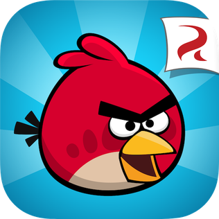
The masthead is widely recognisable as it's a specialised font used on each of their pieces of media. The font is bold, using slightly slanted letters in order to create a sense of movement in replication of the franchises action. The edges of the letters are formed into resembling a bird's wings, this is effective in association and creates a distinct element of the logo. This logo conventionally appears in the left-hand corner, this ensures that the layout doesn't confuse the younger audiences.
The house style is very effective in appealing to a younger audience. The colours used throughout the webpage are bright and lively, they're also used in order to separate the character designs as most of them are associated with different colours. Having differing designs helps to set themselves apart from each other. The font style for the alternative copy on the page is sans-serif and simplistic, this helps to create a hierarchy from the headings (using the classic Angry Bird font). The amount of copy used on the page is limited. This is effective for the target audience as it makes the website easier to operate and the focus on large, cartoon graphics is more likely to attract a younger audience.


The front page displays an image slideshow as the full page. This consists of four images, and can be controlled through the arrows. If the arrows aren't pressed, each image has a time limit until moving on to the next one. A bar is displayed below each image's title to signify the amount of time that is spent on each image before moving on. This use of interactive elements keeps the page in motion, as children’s attention spans are limited it’s important to capture it with a moving, fun design. The call-to-action 'Download now!' promotes the different games works to increase the amount of downloads achieved.


Through selecting 'Explore > Characters', users are allowed to explore all the characters and their alternative designs for their classic game, movie and dream appearances. This feature helps to build knowledge for those interested, with the 'Read more' feature offering a summary on the character. To explore the different characters, the page uses a interactive banner that can be operated using arrows. The page continues the limited use of copy and a large amount of white space to simplify the information provided and avoid overwhelming the user.

Below the fold, there's a bar of social media links. As a franchise aimed at younger audiences, promoting social media is not a main priority as most users won't have access to these sites, However, for those who are allowed or their parents, the social media links can be accessed through clicking on the symbols that represent them.
Comments
Post a Comment